Story behind
As a designer and developer in an IT company, I spend a lot of time on Chrome every day. While I rarely use the functions Chrome provide on the new tab page. So I decided to redesign it to be something better.
I got the inspiration from paper(I mean the partner of pencil not the app :D). With only a piece of paper and a pen, we take notes, daily todos, inspirations, make calculations and almost anything just I think Chrome new tab page is just a perfect place to do all the things mentioned above. It shows up whenever user opens a tab and provides enough space. Sometimes comparing to open an heavy app, a tab is far more easier.
So I started to make it from sketch step by step, from a MVP to 0.1.1. Now it has grown from my first little side project to a product used by thousands of people every day. Try it now.
MVP
In the first MVP version, I just did one thing.
Turn a new tab page into a draft paper
Write & Save notes
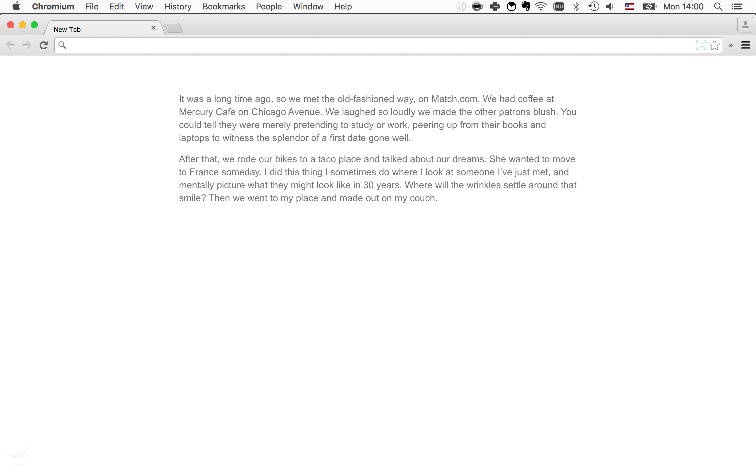
The new tab page is changed into a white draft paper. Users can open a tab and start to type. Whatever they typed will be saved in the browser local storage. Next time, when a new tab is opened, the notes which had been saved will be shown right on the new tab page.
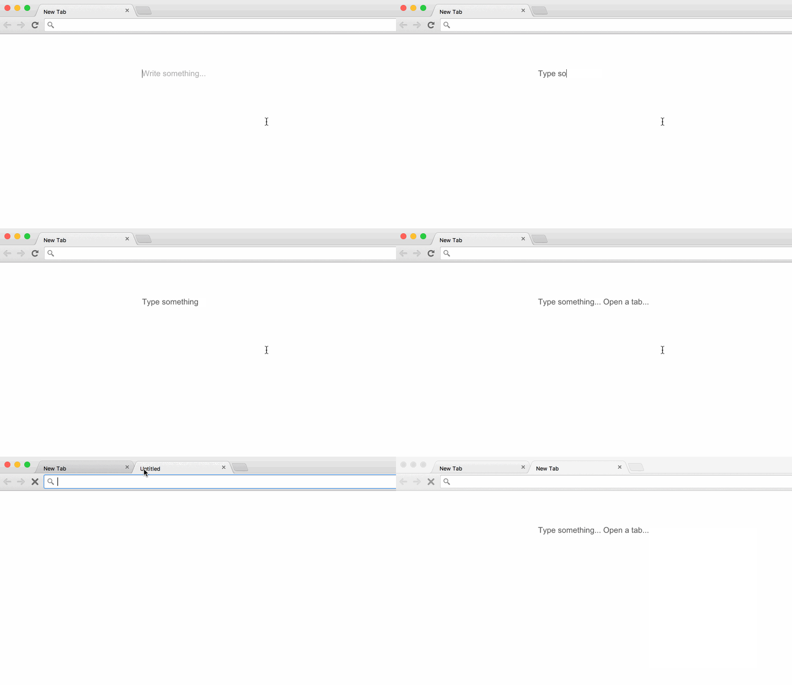
Make calculations
The calculator which system provides does not show the process of calculation.
It is not the way people used to do calculations on draft paper.
Here's how Draft does:
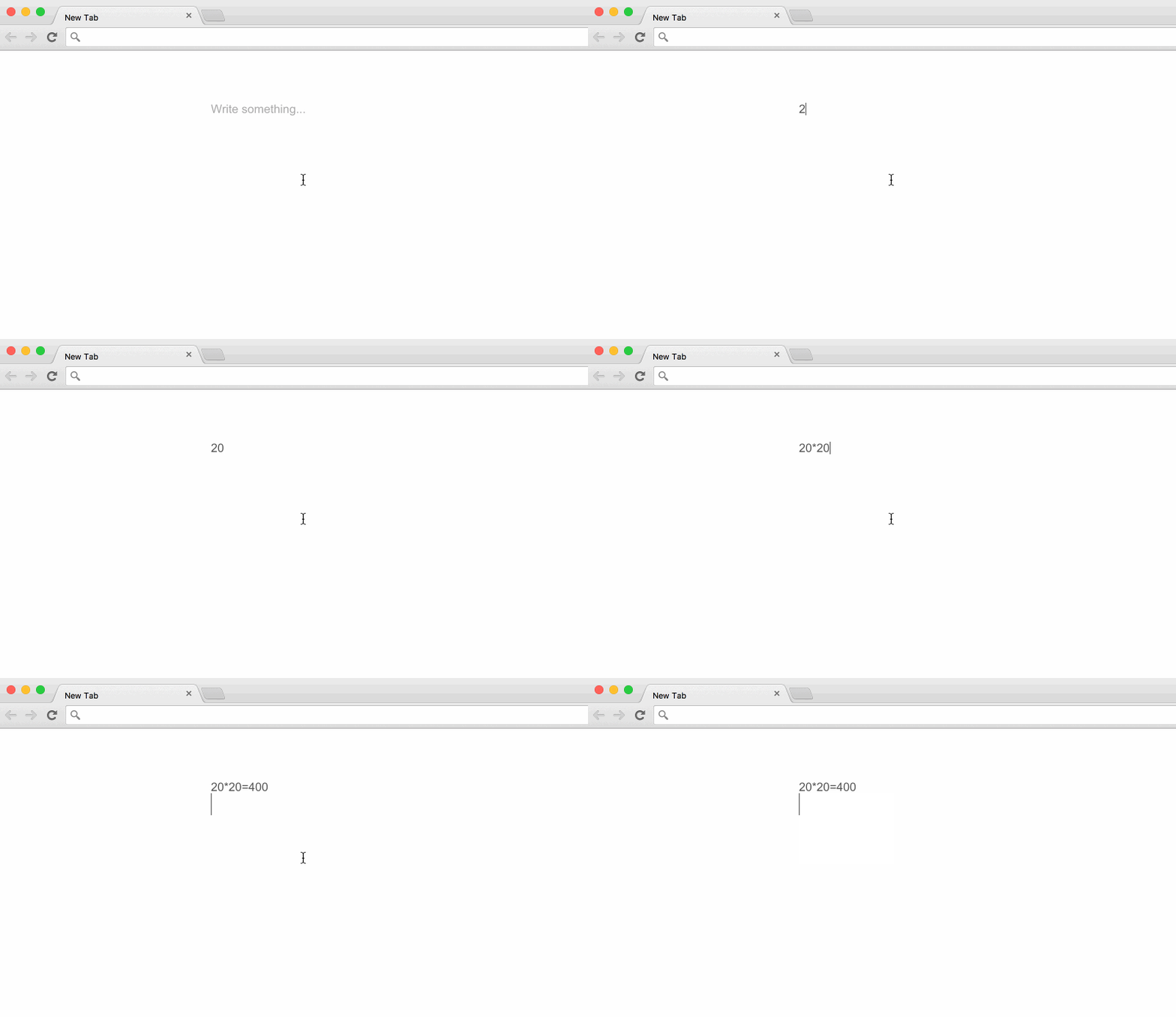
Design
Since I made it just like a piece of paper, the interface design part was very easy.
The most challenging part was how to design the feedback strategy to get more feedbacks from users.
Feedback Strategy
In a MVP version, getting more feedbacks is one of the most important goals. Here is the feedback strategy I've designed to get the goal.
-
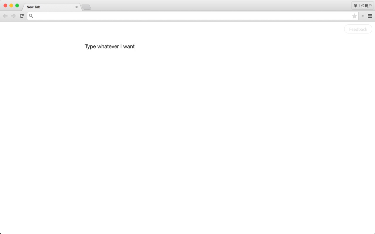
A feedback button was put at an obvious position. So user can make feedback whenever they want.
-
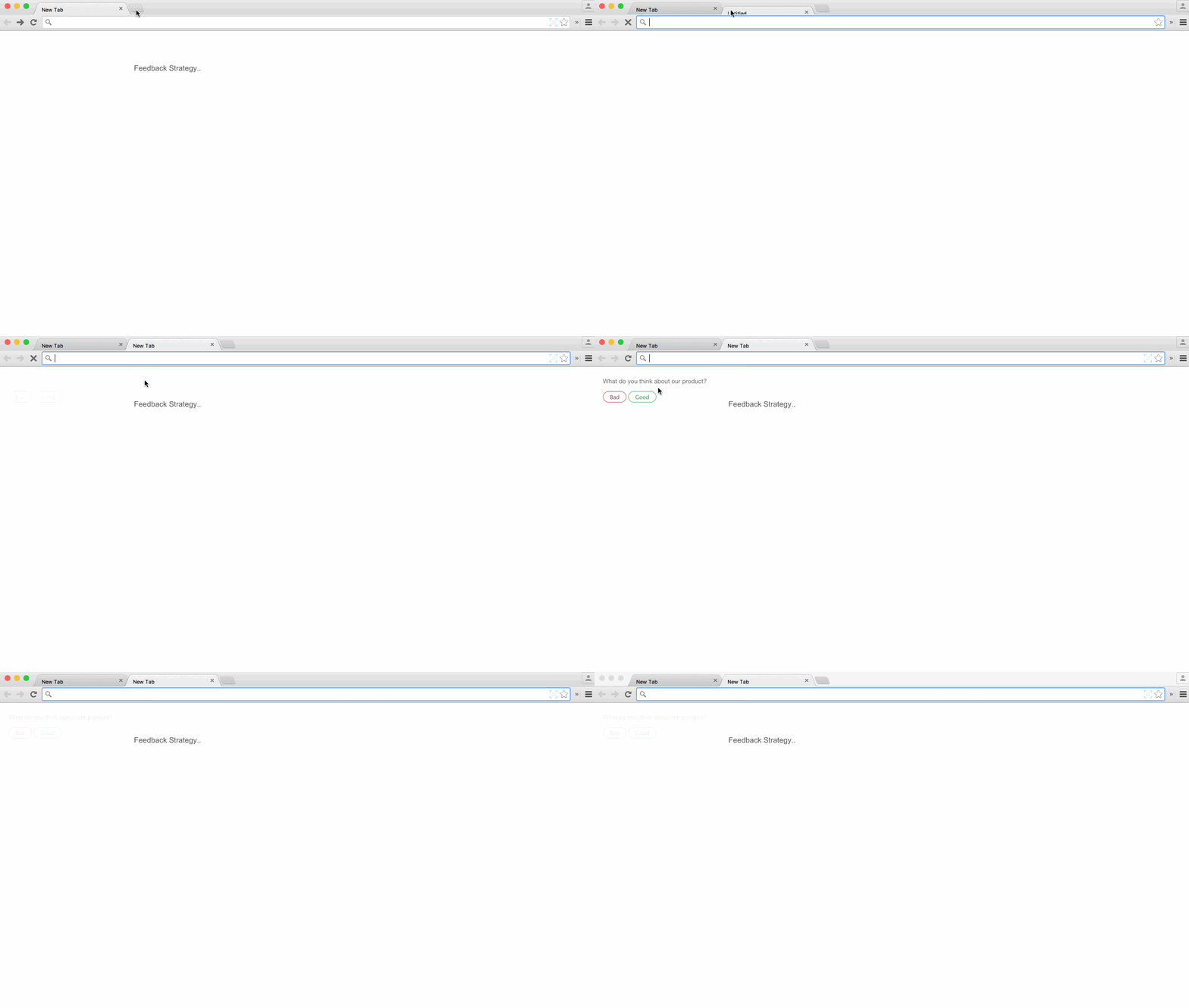
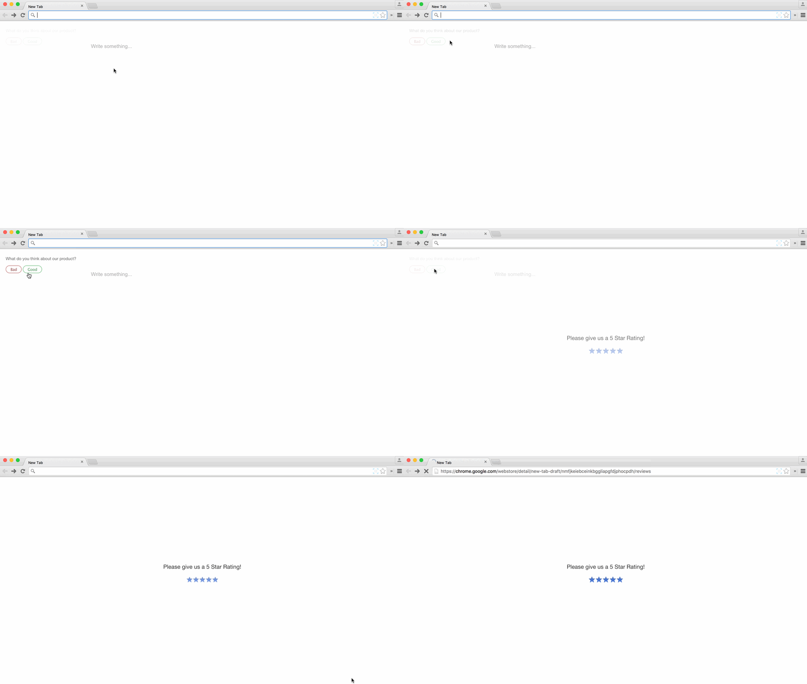
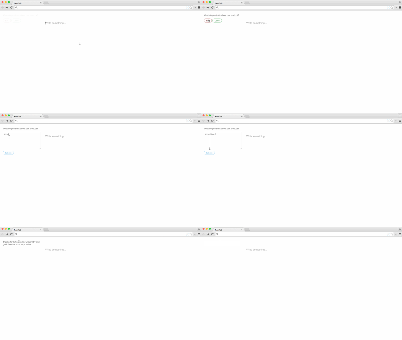
Ask the right question at right time. Even if there's a feedback button at a very obvious place, user may probably not take the initiative to give us feedback. So a feedback question is designed to be shown on the screen which will not disturb user's normal work at the 200th time user open Draft tab. Since people tend to answer multi-choice question, the feedback question is started with a very simple quesion "What do you think of our product? Good/Bad"
-
Lead to do different things. In order to get more good rates and more valuable feedbacks, users were seperated into two groups depending on their choices. For the users who rate Good were lead to rate 5 stars in the Chrome App Store. For the users who rate Bad, a simple form was shown to let them to write feedbacks. And all the feedbacks will be sent to the Google Analytics system.
-
Make statistics. In order to know more about user behaviour, I added Google Event Analytics to user event, so that designs can be driven by the data.
Marketing
In order to test the idea and let more users know my product, I made the steps below to promote my product:
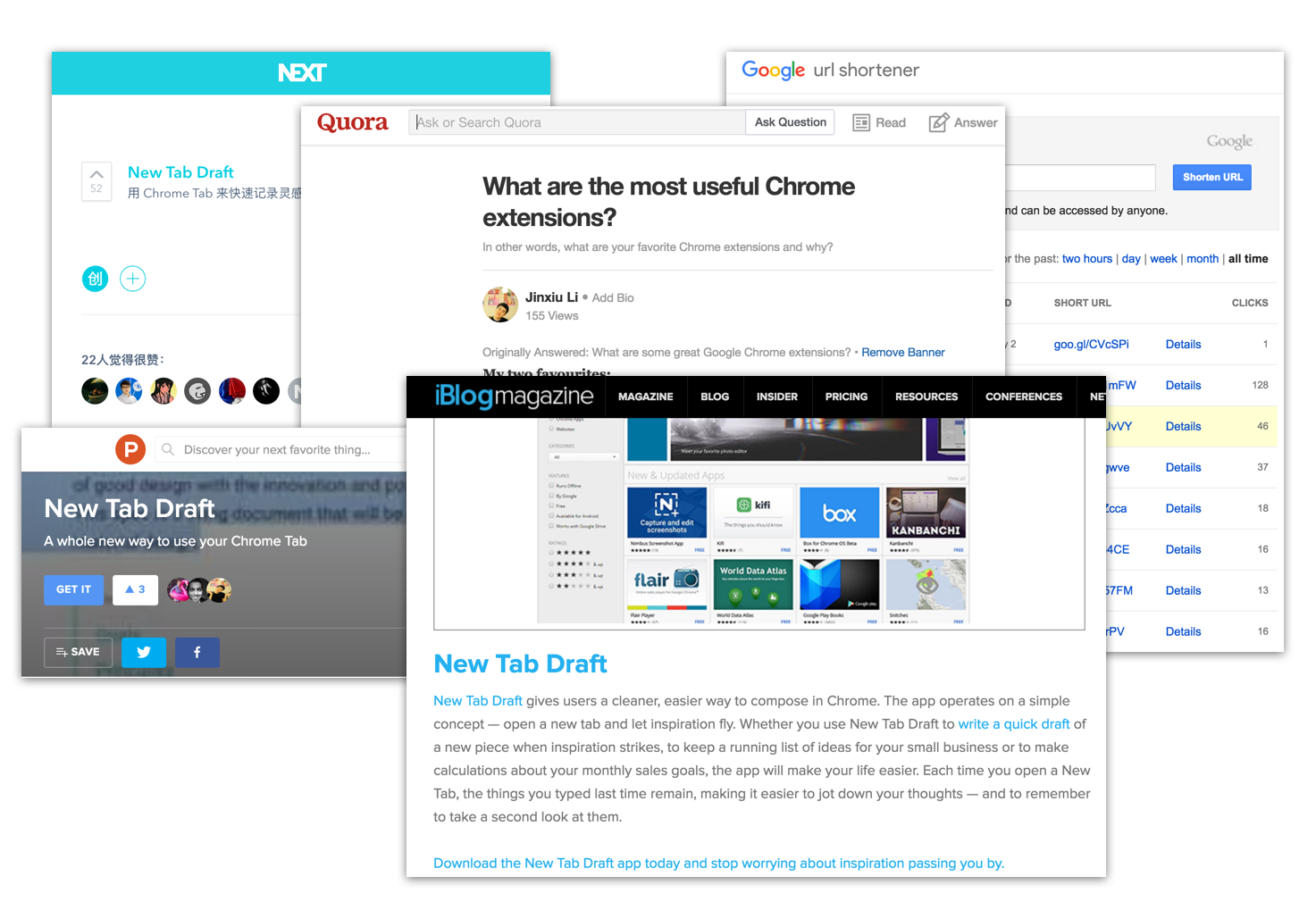
- Publishing Draft on the media platform like Producthunt and Next 36kr.
- Actively communicating with the users in the comment area of the articles about Chrome Extension. And track the link with Google url shortener.
- Writing answers to the questions related to Chrome Extensions on Quora, Zhihu and Reddit.
- Presenting a share meeting in our company to share how to use of Chrome Extension and give some suggestions.
New Tab Draft was also suggested by iBlog Magazine.
Version 0.1.1
After publishing the MVP version, I didn't get time to update it until 1 year later. In the 1 year running, Draft has got a lot of feedbacks from users and I am deeply encouraged and inspired by them.
From the Google Analysis, feedback and marketing strategy was proved to be very successful.

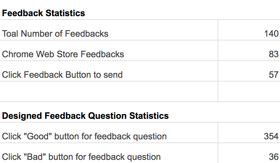
I collected all the feedbacks from GA & Chrome Web Store and put them into a Google Sheet.
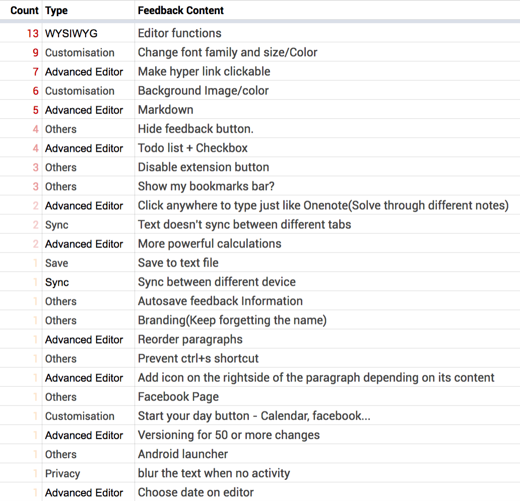
WYSIWYG feature was at the top of the feature list, which doesn't match my original motivation to make a pure and simple draft paper. It will make Draft very heavier and probably slow down the opening speed of new tab.
So I decided to set aside this need and focus more on the user experience & user stickiness.
Changes in 0.1.1
Customisation
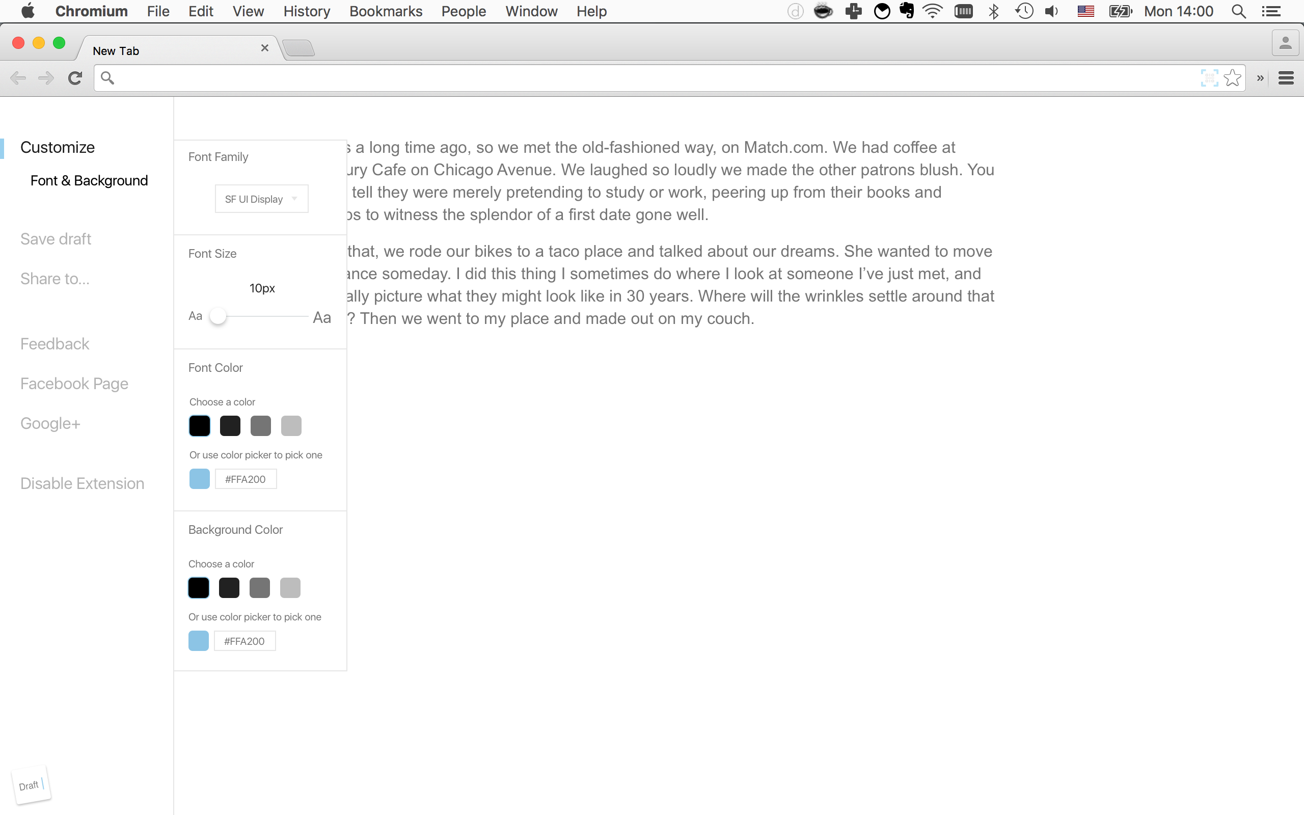
The second top need was customisation. So in order to increase user stickiness and let user make their own new tab style, I added customisation function into 0.1.1.
Customization items include:
- Font Family
- Font Size
- Font Color
- Background Color
Protect User Privacy
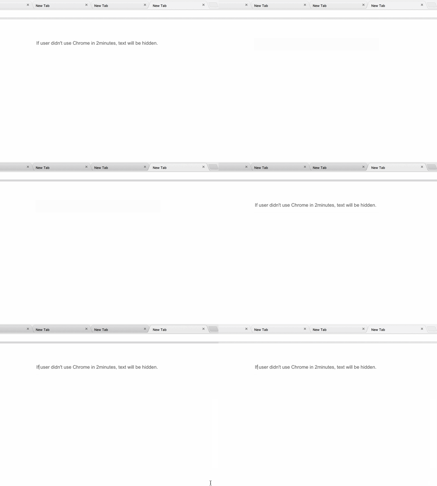
From the feedback, I found that a lot of users really care about where exactly I saved the data and their privacy. So I described more clearly about it in the Chrome App Store and in order to protect user privacy, text user typed will be blured when user haven't used Chrome for 2 minutes.
Save Draft
Let users save Draft with shortcut CMD/CTRL + S.
Facebook Page & Google+ Community
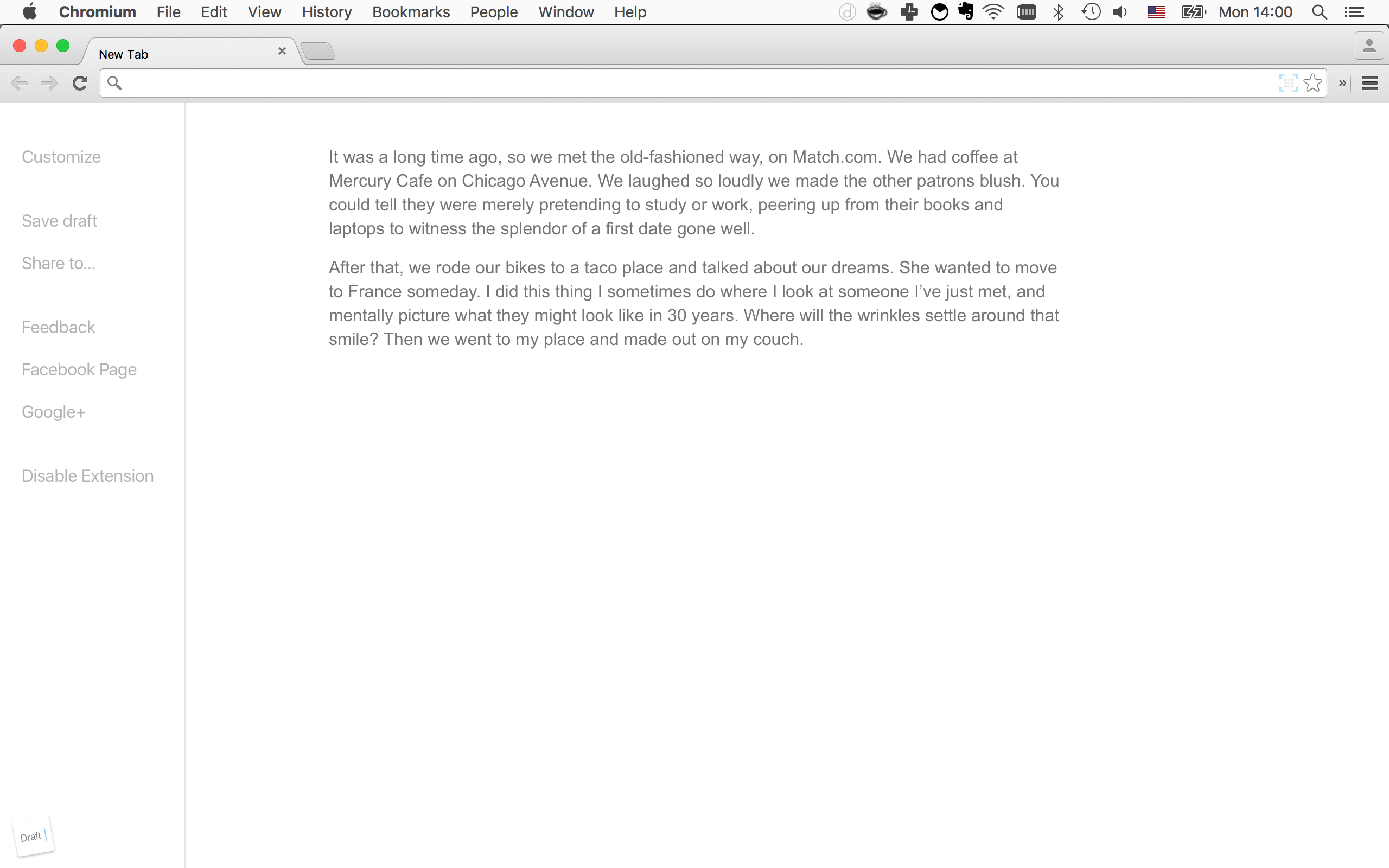
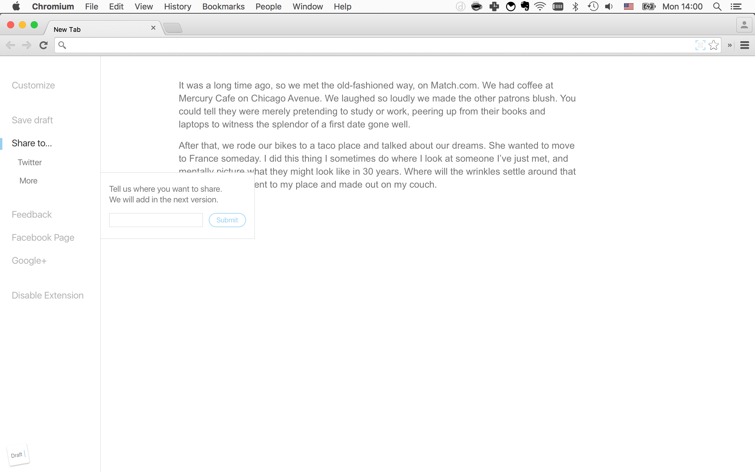
In order to take a closer step with users and let users help spread Draft with other users, I started Facebook Page & Google+ Community .
Hi-fi Mockups
